Frame Link
Visual Services.
Frame Link is your visual backbone to enable better results more easily and affordably. Be it by employing improved standardized workflows, visual consulting, crew booking, specialized equipment rental, or pre-vis services. All perfectly streamlined in an innovative framework, linked from first idea to final delivery. For agencies, production companies, fellow creatives, and crews.
Actually, I'm just here for the freebies...?
You'll find what you are looking for under "Resources" in the main menu. Have fun!
choose your quest
WHAT DO YOU PLAN TO DO?


Crew Booking
This segment will explain how to design text based contents and guide you to use the proper wording and tone.

I'm here for the freebies?
You are going to gather or work on photo or videographic content? This segment will help you keep our style and standards.
No, it's not from fiverr.
LOGO
Following are all guidelines for the use of our logo. In case of any questions, please reach out.
Primary logo
Primary logo in color with company name.
Use:
The logo with the company name must only be used for first interactions, for promotional materials and public relations. Branding on products and deliveries are always to be done in monochrome style. If the text is in any other company color the respective logo color must be used alongside.

Secondary logo
Secondary logo in color without company name.Use:This logo is only to be used on documents. If the text color is different or the color does not read well on the background the below alternative versions are to be used.


Alternative Versions
Monochromatic logo without company name.
Use:
The monochromatic logo is to be used where the primary colors would not contrast well with the surroundings. This logo must not be used for first interactions, for promotional materials, documents or public relations. Choose the color that matches the text color or follow the below guidelines.
The cream monochromatic version is to be used on dark backgrounds.
The highlight monochromatic version is to be used for call to actions and buttons only.
The white monochromatic version is only to be used alongside other white logos on dark backgrounds.
The black monochromatic version is only to be used alongside other black logos on dark backgrounds.
Size and Scaling
The logo should never be smaller than 3 cm or 90 pixels in digital applications. Always scale the logo proportionally. When used alongside other company logos insure that the logo is of equal size and prominence.
Clear Space and Background
Maintain a minimum clear space around the logo, equal to half the height of the logo. Insure that the logos visibility and impact are not compromised. Avoid busy backgrounds.
Legal
It is strictly forbidden to use logo without written consent from Frame Link.
about the warm and the cold
COLOR PALETTE
Key Color (Teal)
This color is the main color.
R: 8 G: 127 B: 140 | #087f8c | hsl 186, 89%, 29% | cmyk 94%, 9%, 0%, 45%
Highlight Color (Golden Yellow)
This color is only to be used for the most important information as well as call to actions.
R: 242 G: 204 B: 3 | #f2cc03 | hsl 50, 98%, 48% | cmyk 0%, 16%, 99%, 5%
Background Colors
These colors can be used for backgrounds in designs.
Light (Cream):
This color is also the main text color on dark backgrounds.
R:240 G:242 B:220 | #f0f2dc | hsl 65, 46%, 91% | cmyk 1%, 0%, 9%, 5%
Dark (Deep Sea):
This color can be used as the text color on bright backgrounds.
R:0 G:49 B:60 | #00313c | hsl 191, 100%, 12% | cmyk 100%, 18%, 0%, 76%
System Colors
The system colors, black and white can be used for text and backgrounds if the colors need to adhere to standards, are part of a product using black and white or additional colors wouldn't work well with the surroundings.
Usage
Insert description and the example chart here.
Judge the book by its cover
TYPOGRAPHY
The main font is "Raleway".
"Playfull display" is a complimentary font for design elements.
Hirarchie:
HEADER
Size 2x Paragraph | Semi Bold | All Caps
Subheader
Same size as Paragraph | Semi Bold
Paragraph / Text
Line Spacing 1.2x
artistic annotation
Same size as Paragraph | Semi Bold | All Caps | only for 1 liners
Alignment:
Never mix different alignments in the same segment, block or document. If more than one alignment style is used in a document the segments must be clearly identified by design elements.
Use center for short paragraphs (up to 100 characters). Center aligned text must not be more than 3 lines.
Use left for long paragraphs (100 characters or more) .
Use justified for long paragraphs (100 characters or more) in blocks or for any text in columns.
Use justified for long paragraphs in blocks (100 characters or more) or for any text in columns.
Text length:
Headers, Subheaders and Artistic Annotations must never be longer than 75 characters! If possible try to keep anything that should be easily understandable as well as read by any audience to the 75 character limit.
If the 75 character length can't be kept we want to use segmentation to keep everything more readable. Following are some examples with a 400 characters text.
Lorem ipsum dolor sit amet, consectetur adipiscing elit. Sed do eiusmod tempor incididunt ut labore et dolore magna aliqua. Ut enim ad minim veniam, quis nostrud exercitation ullamco laboris nisi ut aliquip ex ea commodo consequat.
Duis aute irure dolor in reprehenderit in voluptate velit esse cillum dolore eu fugiat nulla pariatur. Excepteur sint occaecat cupidatat non proident.
Lorem ipsum dolor sit amet, consectetur adipiscing elit. Sed do eiusmod tempor incididunt ut labore et dolore magna aliqua. Ut enim ad minim veniam, quis nostrud exercitation ullamco laboris nisi ut aliquip ex ea
commodo consequat. Duis aute irure dolor in reprehenderit in voluptate velit esse cillum dolore eu fugiat nulla pariatur. Excepteur sint occaecat cupidatat non proident.
Spaceing:
There are 3 different distances:
1. Distance between header and paragraph is 1x text hight.
2. Distance between end of one group of header and text to the next is 2x the text hight.
3. Distance between different segments is 4x the text hight
I hereby extend my most profound apologies.
WORDING AND TONE
Company name
On contract, offers, official and legal documents:
The full name “Frame Link – Visual Services by Damian Derungs” must be stated.
In daily use, "Frame Link" is enough.
It is strictly forbidden to use short from "FL" for marketing and public relations.This short form may only be used for file names and other technical reasons.
Tone
In daily use, only Frame Link is enough.
It is strictly forbidden to use short from FL for marketing and public relations.
LLM style prompt:
Just about anything
CONTENT
Visuals
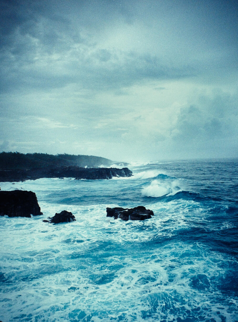
All visuals are done with an analog style, grain, relatively dark exposure and the shallow depth for field.
Graphic overlay
Populate the information as needed
Sound
Populate the information asneeded
MARKETING
Populate the information as needed
© Frame Link - Visual Services by Damian Derungs. All rights reserved.